Blog
15 Oct 2024
New Design for RubyGems.org
by Martin Emde
We are excited to announce the initial release of the new design for RubyGems.org!
The new design is the result of a collaboration with UX designer Ian Taylor and the RubyGems.org core team. Eventually, the full refresh of the site aims to meet our goals of modernizing the design and improving the usability of RubyGems.org for all of our users.
The design will be released incrementally and we’ve chosen the /pages routes to be refreshed first.
These pages contain non-critical, mostly static content, allowing us to release the design without risking problems for our users.
As part of the roll-out strategy, we are prioritizing stability over a “big reveal”.
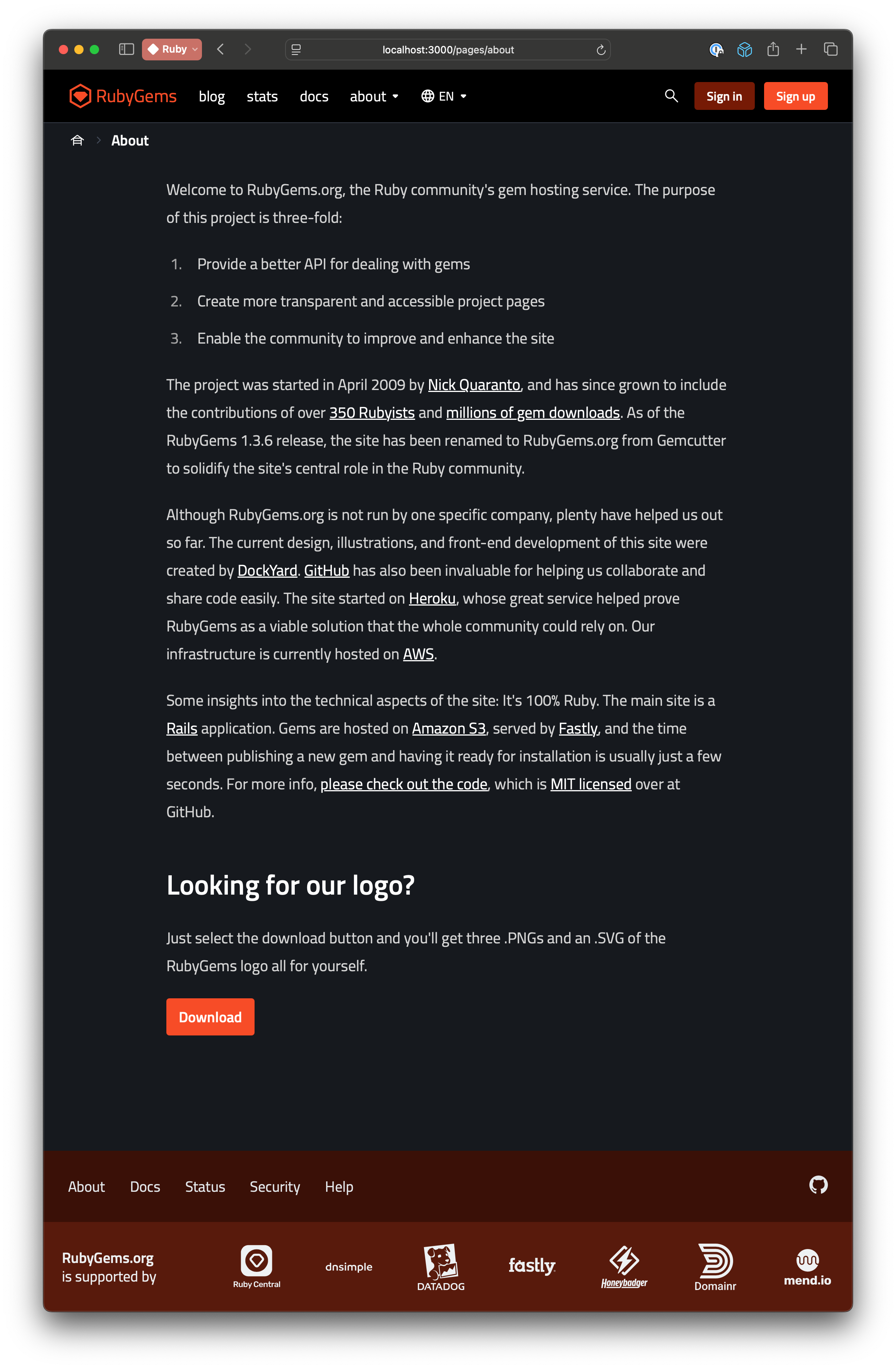
The new design aims to support the full range of devices and browser widths, and much to my relief, it includes a dark mode theme! Please let us know if you run into any usability issues by adding an issue to the project on GitHub or, better yet, by opening a PR to resolve the issue. We want to ensure the site remains functional for everyone!
Help us review the design on your devices
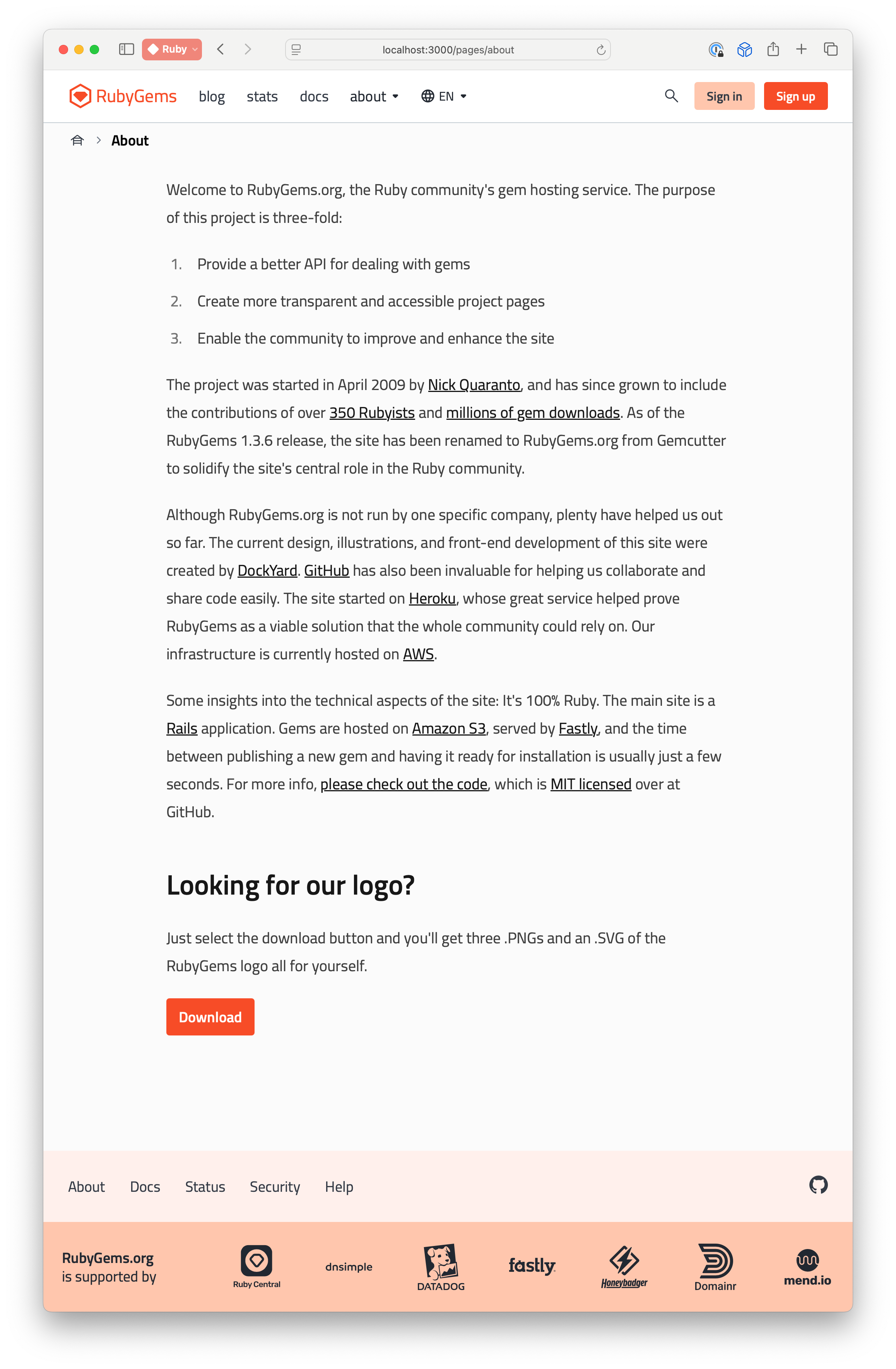
Shortly after this blog post is published, you can visit About and Data to see examples of the new design.
Light mode:

Dark mode:
